Pretty things, maps, and React shenanigans
messing around with Uber's deck.gl in a 2-day quarantine hack
- 20 minsTo scratch my visualisation itch, I invested in a lively period of trying to hack together an interactive website for a course project. Featured in this post: some Python + Notebooks, BigQuery, React, Uber’s deck.gl visualisation framework, GitHub Pages, and a lot of hand-wringing.

I started this little visualisation project in earnest on April 5th as a personal stretch goal for a course project I was working on, and stopped when I handed in the things that were actually due for the assignment on April 7th.
You can probably skip the first section of this post if you just want to see a brief writeup of the work behind this screenshot (or just go straight to the final website). As always, please feel free to leave comments and questions on this post by highlighting some text!
# A Stroll Through Memory Lane
I’ve always wanted to make pretty things, but the tedium of front-end always proved rather intimidating. My time with nwPlus did get the ball rolling though - implementing a nice design and seeing it come to life was quite satisfying.

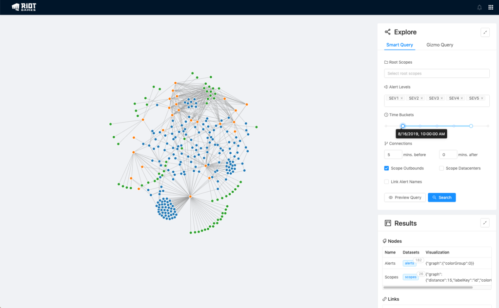
I tried to learn more on making nice user interfaces briefly with my cancelled project, Timelines, and when I went to Riot Games last year, I tried yet again with a project that has been in limbo for a while: Seer (I didn’t even do a writeup for this one yet ![]() )
)
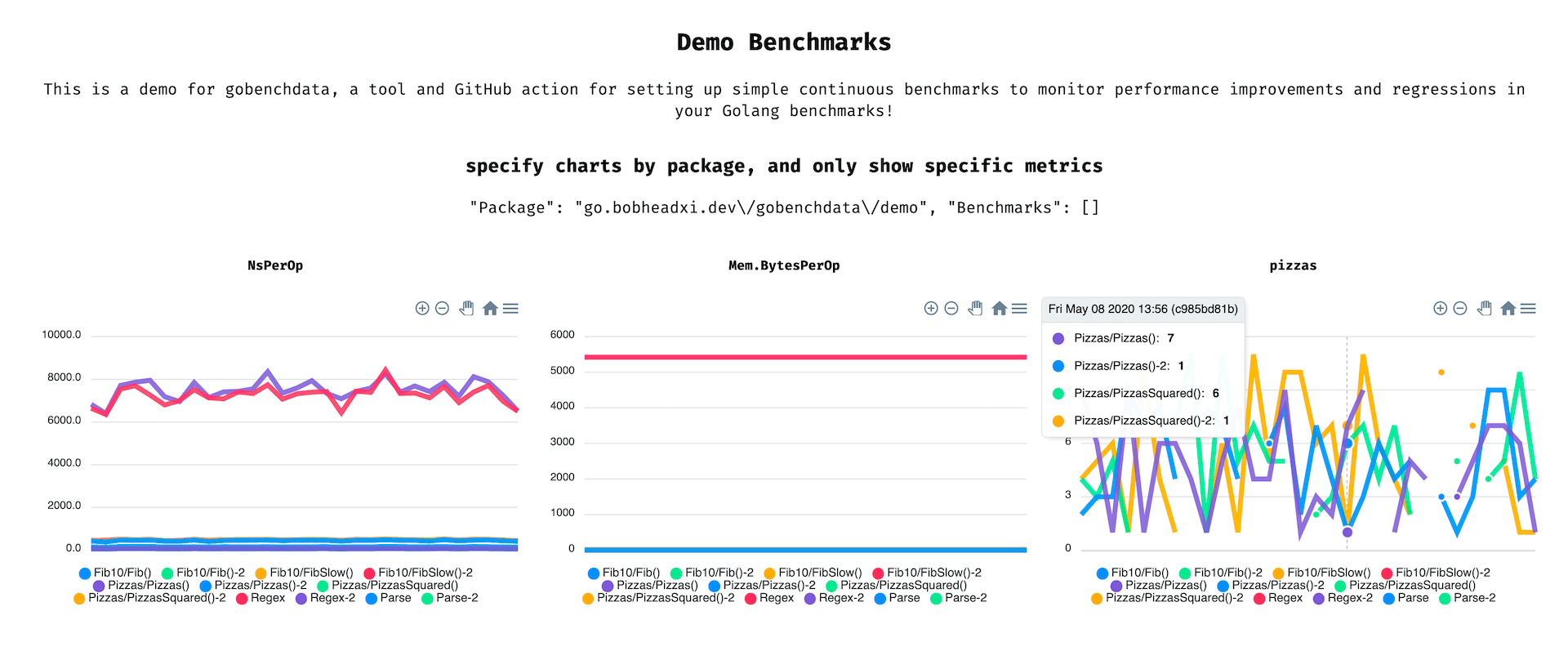
As you can see neither of these projects made it very far, since I got caught up making my backends all well-architected and stuff. I did get some traction with gobenchdata, which was a simple visualisation generator for benchmark results over time, but that wasn’t a super sexy project or anything.
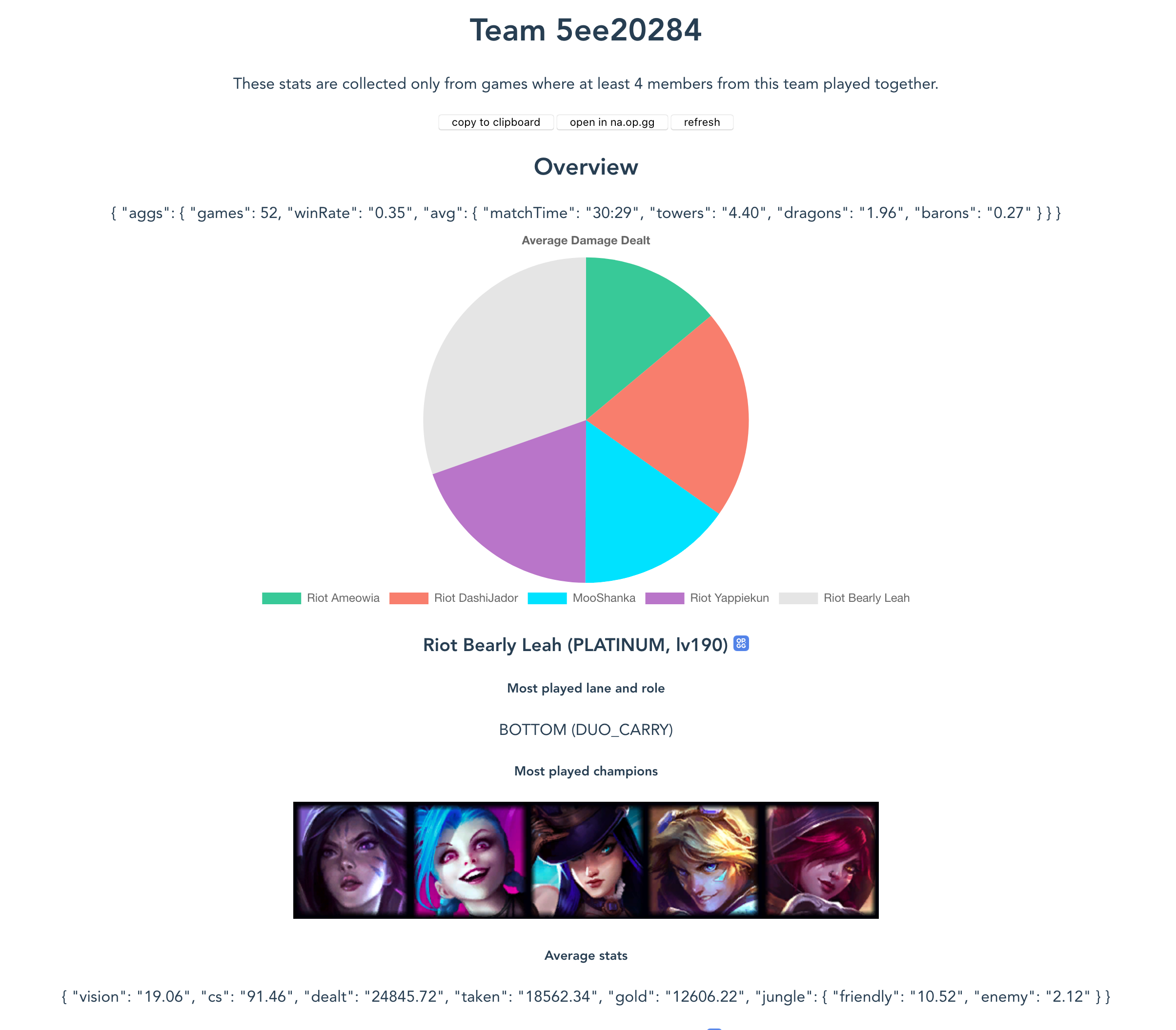
Fortunately, I finished my first intern project at Riot Games with some time to spare so I decided to dive into the making of pretty things more - this time using a design library that was used by my team, Ant Design, and focusing more on data visualisation. My team was very supportive of the project and I got the go-ahead to hack on it for about 2 weeks of my internship which was awesome. ![]()
Since this was a lot of fun, I asked around about data visualisation, downloaded some books, failed to sign up quickly enough for my university’s visualisation course, and proceeded to not do much on this front for almost a year.
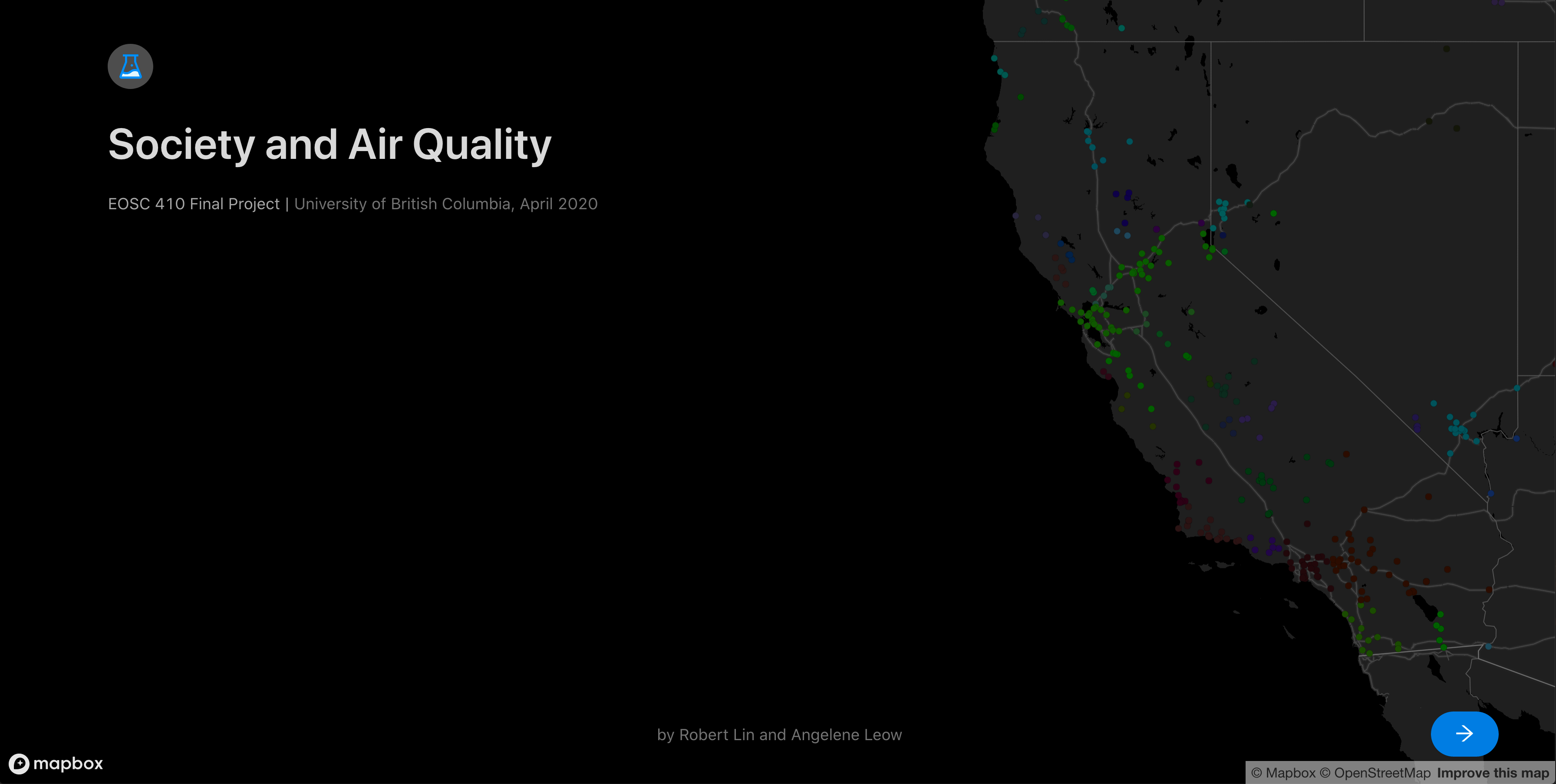
So this semester, to accompany the final project for one of my courses - a small analysis of societal changes and air quality trends - I decided to give it a go again.
# The Visualisation
I often get asked: so what’s the best way to make a website? Do I need some GCP? Some AWS? Some MongoDB? How webscale????
I honestly think for the vast majority of folks the answer is just no, when what they have in mind is a simple portfolio or a showcase or a product website or a signup page. I’ve found that something as available as (and as free as) GitHub Pages alone provides everything most people need for simple use cases, and there are affordable services that can fill in the gaps for slightly more complicated needs.
In a similar vein, when it came more recently to me procrastinating my final project by spending a bunch of time attempting to build a rather extravagant and overkill website when all I needed to submit was a slideshow, of course I had to live by my own words and do this all entirely as a React single-page application hosted on GitHub Pages (including using Pages to host my data!)
# Aggregating Data
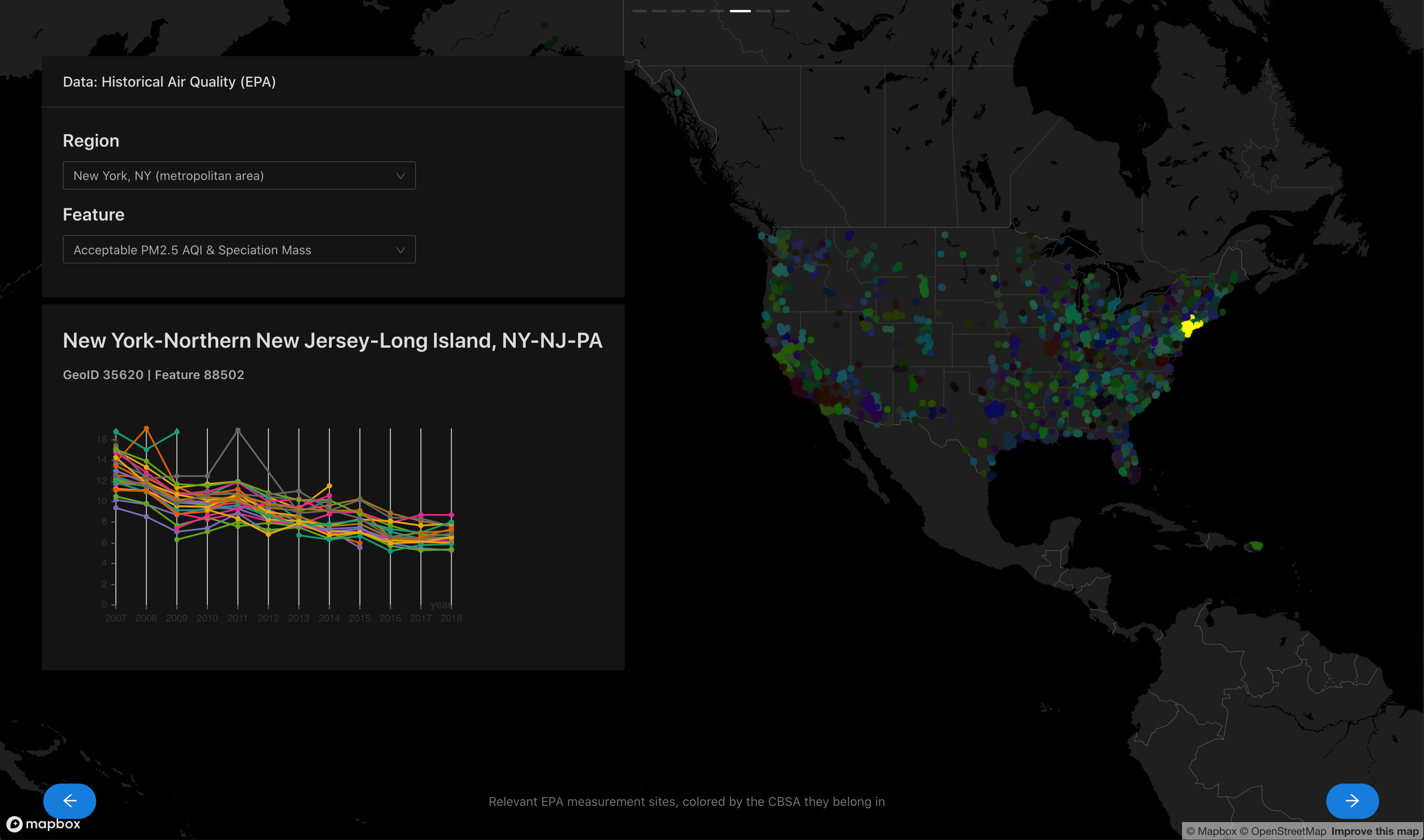
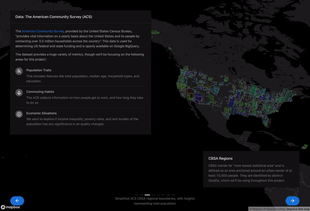
For this particular project we were required to choose some datasets and do some analysis on them. We chose two datasets available on Google BigQuery datasets, the American Community Survey (ACS) from the US Census Bureau (it’s similar to the census, but includes data for every year) and the Historical Air Quality dataset from the EPA (Environmental Protection Agency).
Without a backend it’s not entirely feasible to query massive amounts of data every time a user loads up my website, so I had to do some aggregation to pick out the data I wanted (I mean, I had to do this anyway for the project). I did the majority of this work in Jupyter Notebooks.
- Download CBSA region geometries (ACS data is grouped using these regions) for each year, since they are not fixed. This was a pain to find, and a pain to parse… it was just a pain. See this notebook for details. I also converted these into GeoJSON and later simplified the geometries as well (from ~3GB total to ~2MB total - see this script) so I could use them in the visualisation app without blowing up your browser.
for y in years:
    save_to = out_template % y
    if y == '2007': # 2007 has a special naming scheme...
        target = 'fe_%s_us_cbsa' % y
        url = 'https://www2.census.gov/geo/tiger/TIGER%sFE/%s.zip' % (y, target)
        download_url(url, save_to)
    else:
        target = 'tl_%s_us_cbsa' % y
        if y == '2008' or y == '2009': # some random years have special naming schemes too...
            url = 'https://www2.census.gov/geo/tiger/TIGER%s/%s.zip' % (y, target)
        elif y == '2010': # this single year has a slightly different path...
            url = 'https://www2.census.gov/geo/tiger/TIGER2010/CBSA/2010/tl_2010_us_cbsa10.zip'
        else:
            url = 'https://www2.census.gov/geo/tiger/TIGER%s/CBSA/%s.zip' % (y, target)
        try:
            download_url(url, save_to)
        except:
            print('failed to fetch "%s"' % url)
- The EPA data is provided as measurements collected by stations, where the coordinates of each station is provided. Converting the geometries (shapefiles in this case) into GeoJSON allowed me to just dump it all into BigQuery and use some geospatial functions to do the magic of finding out which stations should belong to which ACS CBSA regions. See this notebook for details. BigQuery is honestly quite nice.
def get_relations_for_year(year) -> pd.DataFrame:
    resp = bq.query('''
        SELECT DISTINCT
            acs.year,
            acs.geoid AS acs_geoid,
            acs.name AS acs_cbsa_name,
            CONCAT(epa.state_code, ".", epa.county_code, ".", epa.site_num) AS epa_site,
            epa.longitude,
            epa.latitude
        FROM
            `eosc410-project.data.epa_air_quality_annual` as epa,
            `eosc410-project.data.acs_cbsa_boundaries_%s` as acs
        WHERE
            epa.year = %s
            AND acs.year = %s
            AND ST_WITHIN(ST_GEOGPOINT(epa.longitude, epa.latitude), ST_GEOGFROMGEOJSON(acs.geometry))
            AND (epa.datum='NAD83' OR epa.datum='WGS84') # guard against irrelevant coordinates
    ''' % (year, year, year))
    return resp.to_dataframe()
- Then I aggregated everything into what I dubbed “flat” formats, where columns names have the region and parameter information encoded into them, and exported them as CSV files for use in the visualisation. I also exported the station coordinates as GeoJSON as well for use in with
deck.gl.
This isn’t very exciting so let’s move on.
# React and DeckGL
See the code for the web app here!
Project setups are a pain, so I just used create-react-app, and despite all its pitfalls I would honestly recommend anyone set on using React to just use it. I wish it came with automatic formatting configuration (it only offers basic style checks) but given my time constraints I didn’t bother setting it up.
The first thing I did is delete almost all the code generated by create-react-app, pick a UI library, set it up, and just stick with it. For a fast turnaround this was a great way to get the ball rolling, since React UI libraries often come with comprehensive setup instructions for create-react-app that you can follow without thinking. For this project I went with antd, a well-documented and (in my opinion) sufficiently nice-looking UI library for React. It came with wonderful setup instructions specifically for create-react-app, which is where react-app-rewired came in (this came in handy later for some other changes I made to the base create-react-app configuration).
I structured the entire app around the antd carousel, where each slide is a React component. Data gets loaded upon initialization from two Contexts and is provided to slide components.
src/
├── App.js
├── slides/
│   ├── Intro.js
│   ├── Questions.js
│   └── ...
└── contexts/
    ├── EPAContext.js
    └── ACSContext.js
    └── ...
A wrapper SingleLoader abstracts away the work of downloading data and providing it to the Context - see the code for more details.
return (
  <Layout style={{ height:"100vh"}}>
    <Layout.Content>
      <SingleLoader context={ACSContext}>
        <SingleLoader context={EPAContext}>
          <Carousel
            ref={ref => { slider.current = ref; }}
            dotPosition="top"
            beforeChange={(_, to) => { setSlide(to); }}
            children={carouselNodes} />
        </SingleLoader>
      </SingleLoader>
    </Layout.Content>
  </Layout.Content>
)
Each slide can subscribe to the ACS or EPA data (or both!) as needed by initialising as a consumer of the context:
return (
  <EPAContext.Consumer>
    {(epa) => {
      // do stuff with data
    }}
  </EPAContext.Consumer>
)
I then set up deck.gl alongside the carousel:
return (
  <Layout style={{ height:"100vh"}}>
    <Layout.Content>
      <DeckGL
        viewState={mapState.viewState}
        layers={mapState.layers}>
        <StaticMap
          viewState={mapState.viewState}
          mapStyle={mapStyles.DARK}
          reuseMaps
          preventStyleDiffing
          mapboxApiAccessToken={MAPBOX_API_TOKEN} />
      </DeckGL>

      {/* carousel */}
    </Layout.Content>
  </Layout.Content>
)
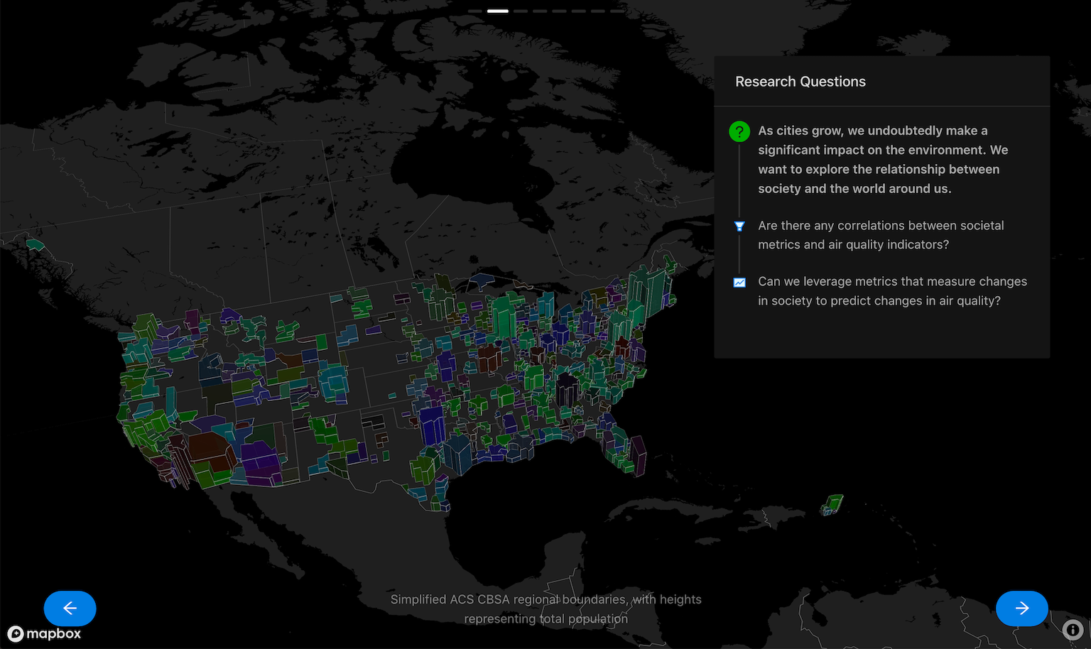
Each slide is provided with a callback that can be used to update the map state by providing a new viewState or new layers to render. A viewState defines where and how the camera is looking at the visualisation - for example, the introduction slide sets the following viewState and layers:
updateMapState({
  viewState: {
    // california area
    longitude: -128.41669,
    latitude: 37.7853,
    // zoom close
    zoom: 5,
    // look top-down
    pitch: 0, bearing: 0,
  },
  layers: [
    new GeoJsonLayer({
      id: 'intro-epa-layer',
      // stations in most recent year
      data: epa.stations[epa.stations.length-1],
      // fill each with a color generated from their GeoID (region)
      pointRadiusMinPixels: 3,
      getFillColor: (d) => {
        const { properties: { acs_geoid: geoid } } = d;
        return geoidToColor(geoid);
      },
    }),
  ],
});
Then, when you visit the website and land on the intro slide, the map loads up like this:
Changing the pitch and bearing also yields cool results, this example using the simplified CBSA region geometries I collected earlier, and adds some extrusion for dramatic effect:
const { timeseriesFlat, regions } = acs;
updateMapState({
  viewState: VIEW_STATES.US_LEFT, // pitch: 45, bearing: 15
  layers: [
    new GeoJsonLayer({
      id: 'questions-acs-layer',
      data: regions[regions.length-1], // most recent year data
      pointRadiusMinPixels: 3,
      // set color as geoid, as before
      filled: true,
      getFillColor: (d) => geoidToColor(d.properties.geoid),
      // scale polygon height using total population
      extruded: true,
      getElevation: (d) => {
        const { properties: { geoid } } = d;
        // get row of most recent year, and take column with total_pop parameter for this region
        const pop = timeseriesFlat[timeseriesFlat.length-1][`${geoid}.acs.total_pop`] || 0;
        return Math.sqrt(pop) * 100;
      },
    }),
  ]
});
acs.total_pop value provides a neat-looking extrusion based on the population of each region. Also note that thanks to antd, positioning nice-looking elements all over the screen is pretty easy, and offers a lot of knobs to tweak to adapt your content across different screen sizes. I didn’t try too hard to make it mobile-friendly, but it’s nice to know the capability is there and that you don’t have to do it yourself.
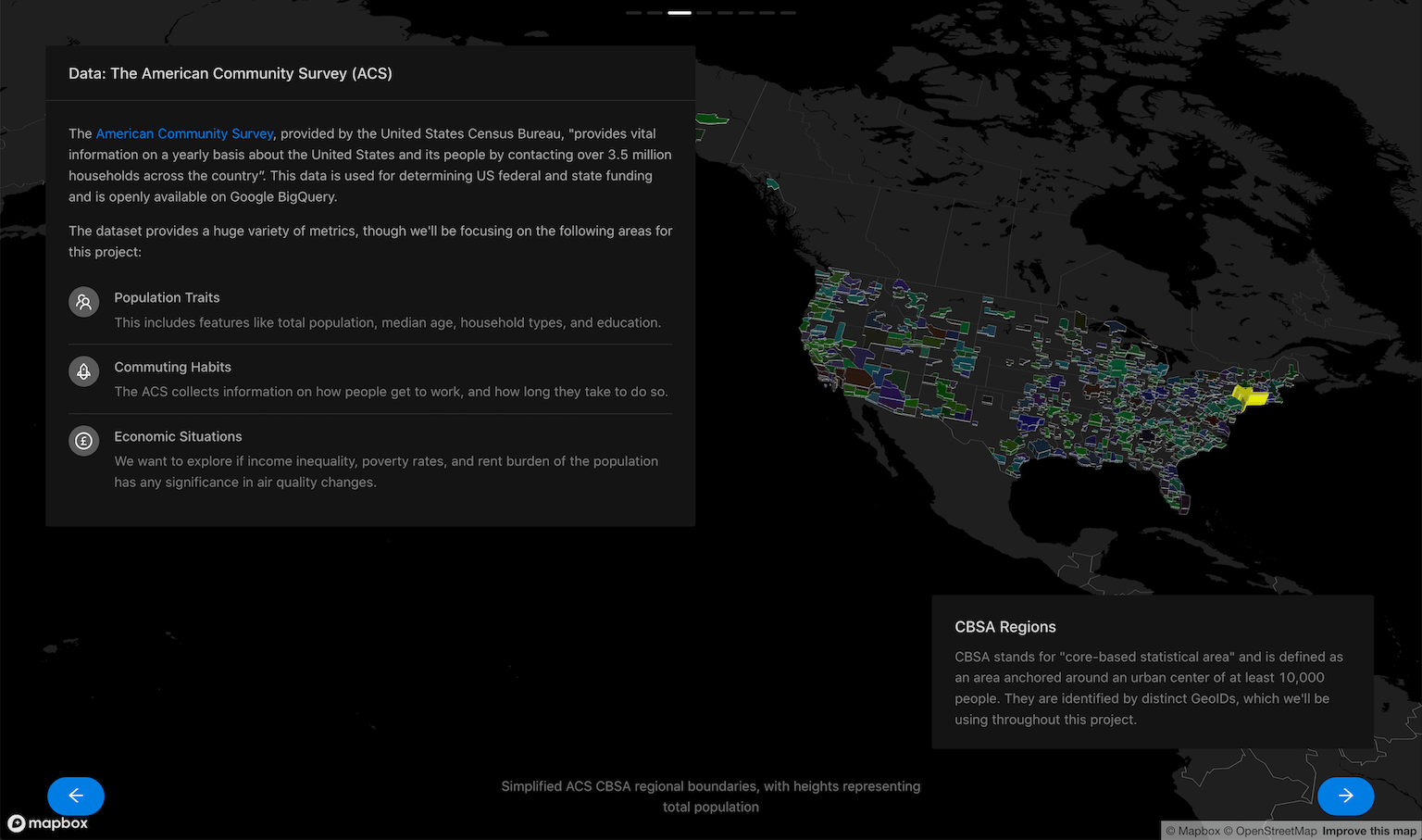
This is probably my favourite slide - see the source code here. This particular slide only took 83 lines of code on its own!
# A Big Mistake… Mis-state?
While cool, unfortunately it turns out that this setup is probably a big mistake. Here’s how I wrote the callback:
const [slideID, setSlide] = useState(0);
const carouselNodes = slides.map((Slide, id) => (
  <Slide
    slideID={id}
    isSlideSelected={id === slideID}
    updateMapState={(newState, updateID) => {
      const stateUpdateID = updateID || id;
      // TODO making mapState a dependency of carousel causes infinite loops.
      if (stateUpdateID !== mapState.prevUpdateID) {
        setMapState({
          prevUpdateID: stateUpdateID,
          // ... assign params from newState
        });
      } else { console.log(`discarding map update ${stateUpdateID}`); }
    }} />
))
As noted in my hasty TODO, a huge problem arises in my state in between map updates and keeping track of what slide is currently active, the following happens on each render:
graph LR
  App -- render on mount --> Slide
  Slide == setMapState on mount ==> App
  App == "render again (setMapState depends on mapState)" ==> Slide

I hacked in an updateID to prevent a slide from making multiple map updates, but it also means that later on for my data exploration slides, the map is not interactive - a slide cannot make more than one update at a time ![]() This really kills the vibe because I had wanted a slider on the panel to let you slide through the entire country’s data over the years, as well as highlight selected regions, and show different data on the map based on the selected parameter.
This really kills the vibe because I had wanted a slider on the panel to let you slide through the entire country’s data over the years, as well as highlight selected regions, and show different data on the map based on the selected parameter.
I’ll have to revisit this at some point - I’m sure there’s a “right” way to do this, and that I’m just holding React all wrong, but I’ve already spent a lot of time getting everything to this point so for now I’m just stuck with a rather uninteractive map.
✅ Update(4/10/2020): I spent some time fiddling with this and managed to get some basic interactions working by moving context subscription to the topmost level (I suppose rendering it pointless, but oh well) and removing all mapState depenedencies from updateMapState. Slides then check for loading/error state, and if they are selected, call updateMapState through useEffect. Check out the commit here! It’s not very clean, and I still can’t get map transitions working so I suspect I’m still doing something wrong, but it’s something.
# GitHub Pages
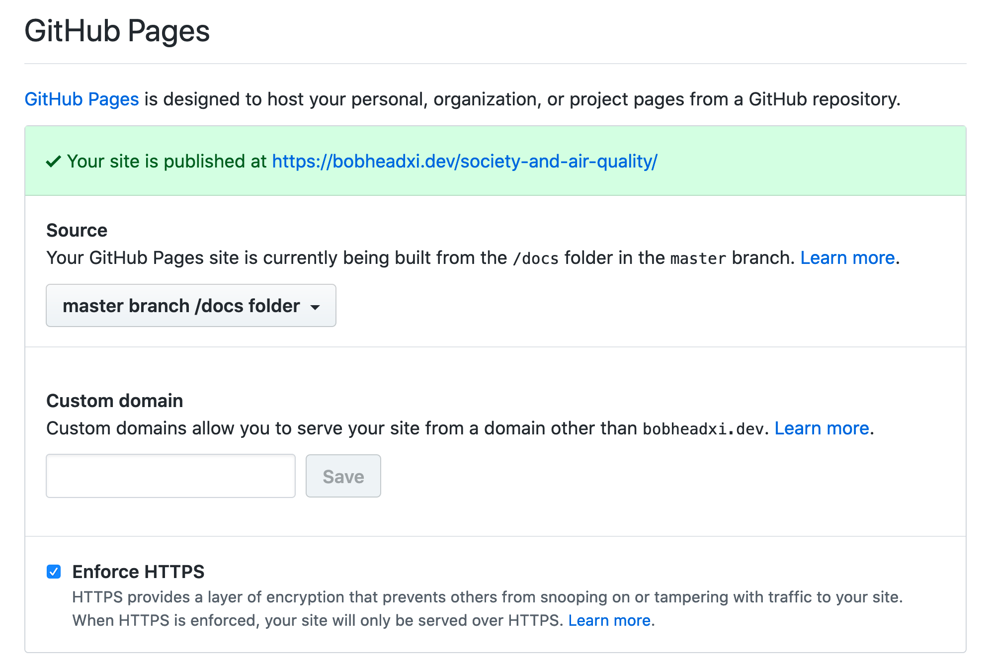
To make all my aggregated data available through GitHub pages I opted for the option of deploying the docs folder in my master branch, though you can do it through any of the other options as well. Putting my aggregated data into this folder meant it’s available to my GitHub pages-hosted React app, both locally and when deployed:
const fetches = [
    '/_data/epa/timeseries_flat.csv',
    '/_data/epa/timeseries_vert.csv',
].map((f) => fetchCSV(f));
const results = await Promise.all(fetches);
On the React side (which I’ll get into soon!), I’ll just point out that you must make two adjustments when using GitHub pages + the /docs folder:
- set
homepageto your GitHub pages URL (by default, something likeusername.github.io/reponame)
+++ package.json
{
-
+  "homepage": "https://bobheadxi.dev/society-and-air-quality",
}
- add
PUBLIC_URL=/to override thehomepagesetting when you are running the app locally
+++ package.json
  "scripts": {
-    "start": "react-app-rewired start",
+    "start": "PUBLIC_URL=/ react-app-rewired start",
  }
- move your data into
publicduring development, and move your data out during build so that it doesn’t included - this makes the data accessible from the same/_data/...URLs that you’ll use when the app is deployed
+++ package.json
  "scripts": {
+    "data": "mkdir -p ./public/_data/epa ; mkdir -p ./public/_data/acs ; cp -r ../docs/_data/epa/. ./public/_data/epa && cp -r ../docs/_data/acs/. ./public/_data/acs",
+    "clean": "rm -rf ./public/_data",
+    "prebuild": "npm run clean",
-    "build": "react-app-rewired build",
+    "build": "react-app-rewired build && cp -r ./build/* ../docs",
+    "postbuild": "npm run data"
  }
Note that react-app-rewired is equivalent to react-scripts from create-react-app, and was set up so that I could customise the antd theme.
And that’s all you have to do! Deploy your pages with a npm run build and push it to master, and it’ll be available on the world wide web - all for a grand cost of $0.
# Final Results
If the screenshots so far weren’t satisfactory, the entire unfinished website is available at bobheadxi.dev/society-and-air-quality. Not everything works entirely as I want it to at the moment, but enjoy!
Writing this up has also made me realise this all looks kinda easy. Did this really take me almost two straight days of work? I suppose it’s a lesson that in between reading documentation and getting through small issues or bugs or misunderstandings and all sorts of miscellany, time can fly by rather fast, and it’s easy to underestimate work.
Or maybe I just need to git gud as they say ![]()