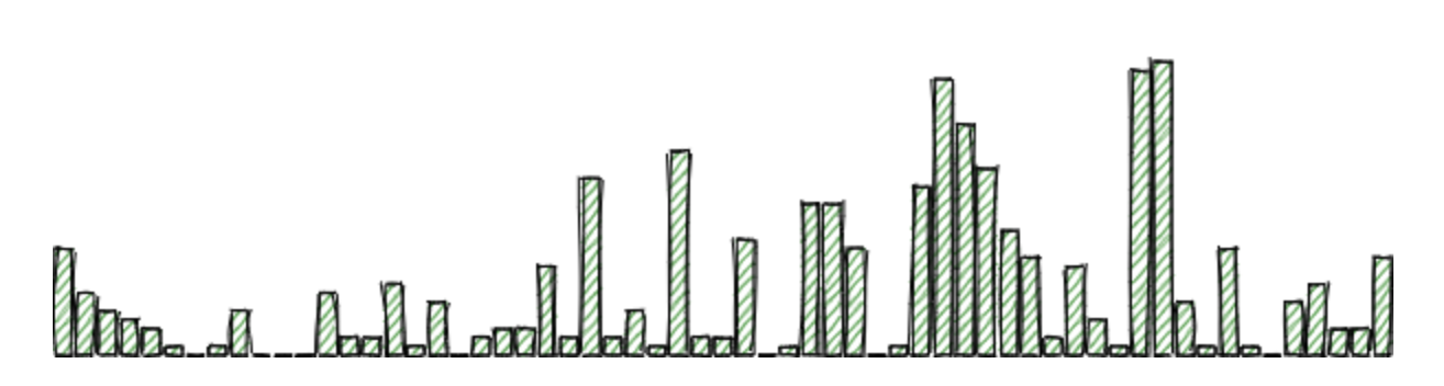
GitHub activity chart with Rough.js
create a simple GitHub activity chart for your personal website!
- 7 minsSo the other day I had a sudden, irresistible urge to make something using the Rough.js library, which lets you make gorgeously sketchy graphics. The urge probably originated from the fact that I had exams I was meant to study for.
I figured that since I’ve got a healthy amount of GitHub activity lying around, I might as well use this opportunity to put that activity to good use: by making a cute little chart of how much git commit I’ve been doing recently.

To get started, you’ll want to include Rough.js and d3 libraries somewhere in your header:
<script src="https://cdn.jsdelivr.net/npm/roughjs@3.1.0/dist/rough.min.js"></script>
<script src="https://cdnjs.cloudflare.com/ajax/libs/d3/5.12.0/d3.min.js"></script>
And set up a div to populate with your chart:
<div id="canvas-container" height="150px">
  <canvas id="canvas"></canvas>
</div>
For contribution data, I opted to use the custom API used by sallar/github-contributions-chart, which provides the contribution data in a nice and easy-to-use format (it does not seem like GitHub offers an official way to get the data in a format like this):
{
   "years":[ /* yearly summaries */ ],
   "contributions":[
      // ...
      {
         "date":"2019-11-03", // future days are included with "count": 0
         "count":0,
         "color":"#c6e48b",
         "intensity":0
      },
      {
         "date":"2019-11-02",
         "count":12,
         "color":"#c6e48b",
         "intensity":1
      },
      {
         "date":"2019-11-01",
         "count":1,
         "color":"#c6e48b",
         "intensity":1
      },
      {
         "date":"2019-10-31",
         "count":6,
         "color":"#c6e48b",
         "intensity":1
      },
      {
         "date":"2019-10-30",
         "count":33,
         "color":"#7bc96f",
         "intensity":2
      },
      // ...
   ]
}
Here’s the entire snippet, edited slightly for brevity and with comments added explaining what is going on:
const user = 'bobheadxi';
const corsAnywhere = 'https://cors-anywhere.herokuapp.com';
function drawChart() {
  // start off by requesting contribution data. as of oct 2020, this API now requires CORS
  // enabled - we use the cors-anywhere proxy service to make the request instead.
  return fetch(`${corsAnywhere}/https://github-contributions.now.sh/api/v1/${user}`)
    .then((resp) => resp.json()) // turn that request data into JSON
    .then((data) => {
      // figure out what our current dimensions are - I chose to always let the
      // height be the same
      const maxWidth = document.getElementById('canvas-container').clientWidth;
      const maxHeight = 150;

      // force the canvas to fill the container
      const canvas = document.getElementById('canvas');
      canvas.width = `${maxWidth}`;
      canvas.height = `${maxHeight}`;

      // the API provides a bunch of zeroes for days in the future, (see the
      // sample data above) so I strip leading zeroes out. this also has the
      // "benefit" of not showing recent inactivity on your generated chart ;
      //  you could probably improve this by actually figuring out which entry
      // corresponds to the current date, but I was too lazy
      let firstNonZero = 0;
      for (let i = 0; i < data.contributions.length; i++) {
          if (data.contributions[i].count > 0) {
              firstNonZero = i;
              break;
          }
      }

      // based on the width, calculate how many days of activity to show so that
      // we get nice-looking bars to fill the space
      const barWidth = 8;
      const barGap = barWidth / 4;
      const days = Math.floor(maxWidth / (barWidth + barGap));

      // get the most recent days (as we just calculated) and turn the array of
      // contributions objects into an array of numbers, then reverse it to get
      // the most recent ones first.
      const counts = data.contributions
        .slice(firstNonZero, firstNonZero+days)
        .map(c => c.count)
        .reverse();

      // get the max so we can scale the bars to kind of fill the height
      const max = d3.max(counts);
      const heightFlex = maxHeight / (max + 4);

      // get your canvas, and iterate over the data to draw in the bars. in
      // hindsight, the load time can probably be improved by merging this with
      // the array manipulations earlier. as textbook authors like to say,
      // "we'll leave this as an exercise for the reader".
      const rc = rough.canvas(canvas);
      counts.forEach((d, i) => {
        // calculate appropriate dimensions for this bar. we want to position
        // the bars with a bit of a gap to avoid having the canvas crop out the
        // "sketchy" rectangle borders (hence the +1 and -1), and give each bar
        // a bit of space to flex their sketchiness.
        const barHeight = heightFlex * d;
        const dim = {
            x: i * (barWidth + barGap) + 1,
            y: maxHeight - barHeight - 1,
            w: barWidth,
            h: barHeight,
        };
        // I choose green because GitHub uses green, but you can adjust this
        // as you wish!
        rc.rectangle(dim.x, dim.y, dim.w, dim.h, { fill: 'green' });
      });
    })
    .catch((err) => console.error(`chart generation error`, { err }));
}

// draw the chart on page load and scale it when the window size changes!
window.onload = drawChart;
window.onresize = drawChart;
It’s not the fastest thing in the world and could probably do with a lot of improvement, but it works for now!